

Portfolio
New Moon Coffee
- 2025
- Logo Design
- Brand Identity
Challenge
New Moon Coffee & Roastery approached us with a uniquely personal and visually offbeat request: to create a brand identity involving a raccoon with an element of coffee. The raccoon element was symbolic of the founder's spirit and values, while the moon and "new moon" phase in particular, represented transformation and new beginnings, both metaphors for her dream of building a community-rooted coffee shop.
Approach
My goal was to distill this narrative into a logo that felt warm, intentional and representative of the business, while balancing the illustrative side with it's ability to scale and be tweaked across different kinds of media. Early on I explored a broad range of visual interpretations to help the client clarify her vision, ranging from geometric and minimal, to illustrative. Each concept integrated the core element of featuring a raccoon, but through different stylistic lenses. I worked toward a concept that resonated with the founder and the business.
A Cozy Vibe
During our early discovery sessions, the client shared a Pinterest board filled with earthy, texture-rich interior inspirations filled with warm woods, plants, soft lighting and vintage accents. These references informed the visual direction and color palette, influencing the brand’s tone.
While the logo maintains a clean and structured design, I incorporated a distressed metallic texture into the crescent moon element as a nod to lunar craters. This detail highlights the moon symbolism, but also welcomes a rustic, tactile quality that echoes the homey vibe of the coffee shop environment. It softens the sharpness of the composition and unifies the identity more closely to the physical manifestation of the space.
The Logo
The final New Moon Coffee logo is a visual storytelling piece, full of symbolism that I love to incorporate as a designer whenever the chance presents itself. At the heart of the mark is the raccoon, chosen for its personal significance to the founder and for what it represents, as they are adaptive urban creatures full of curiosity and a tenacious spirit.
The raccoon (with it's 5-fingered hands if you didn't know) cradles a cup of coffee with mysterious mists of steam emanating from the freshly poured brew. We cannot in the end forget that we're in the business of roasting and selling coffee. While these are very literal representations within a logo, it helps draw the captive eye of potential customers and to set the tone for the brand and business, as an inviting community-rooted space. A place to relax, get comfortable and awaken the senses with the wafting rich scent of roasting coffee.
Framed within a waxing crescent moon, the logo also becomes a symbol of growth and new beginnings. Subtle details like the swirling latte art, rising steam and twinkling stars add a sense of ritual and magic to these intimate coffee-drinking moments, making the mark feel more like an illustrative scene than a static, soulless, generic icon.
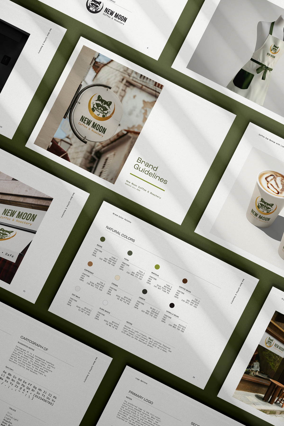
Brand Guide
To help ensure the New Moon Coffee & Roastery brand launched with consistency, I created a comprehensive brand guide that established the foundation for its visual identity across multiple media types.
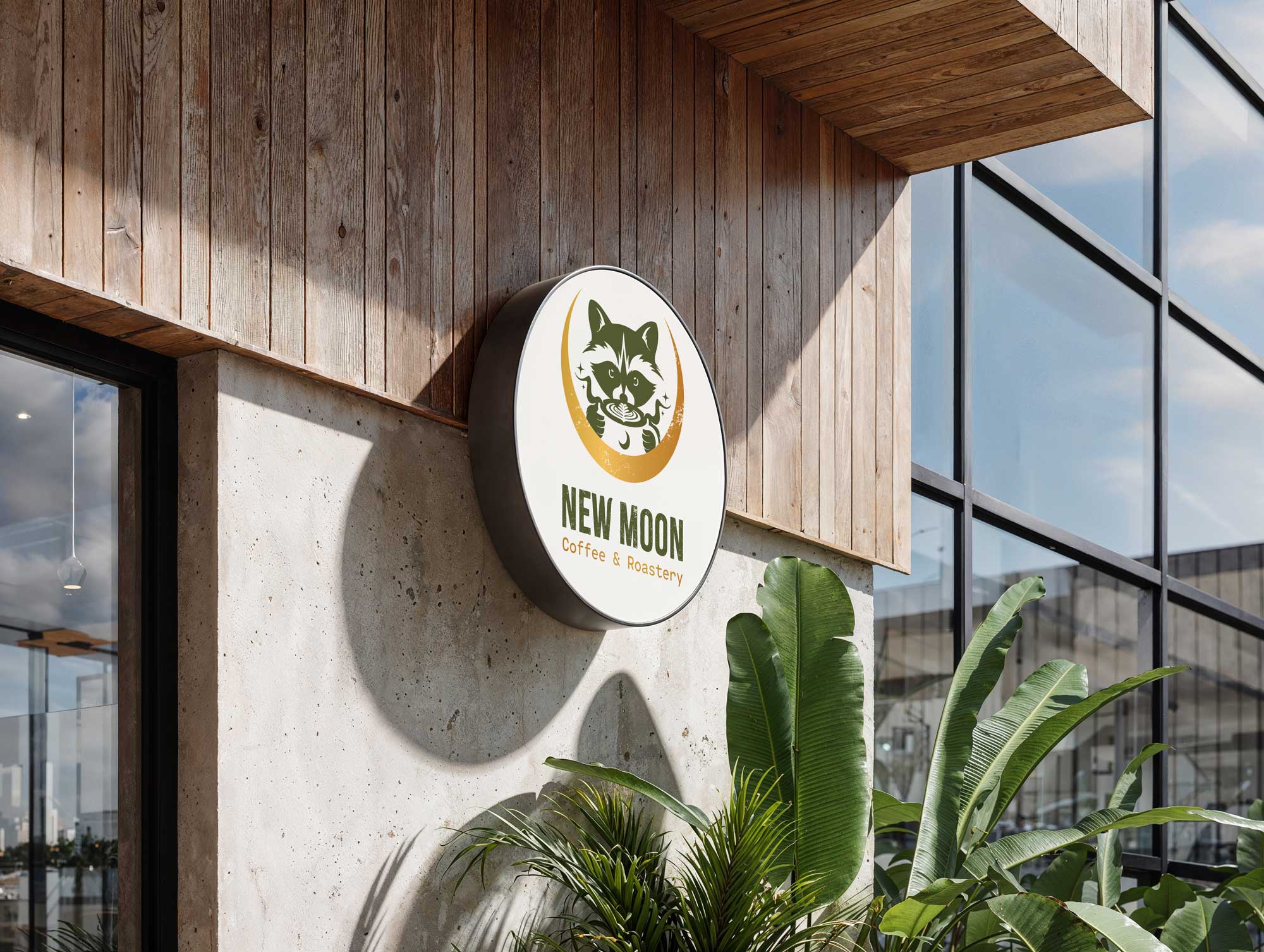
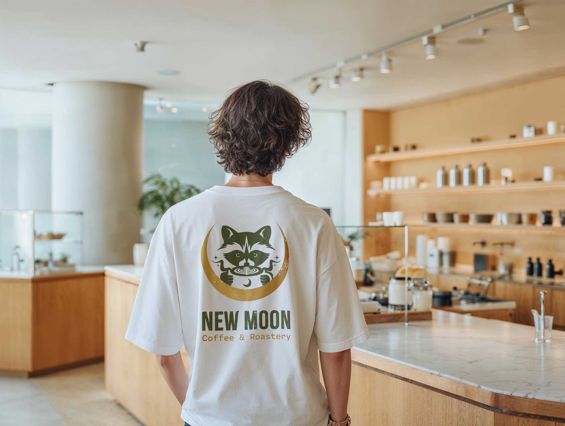
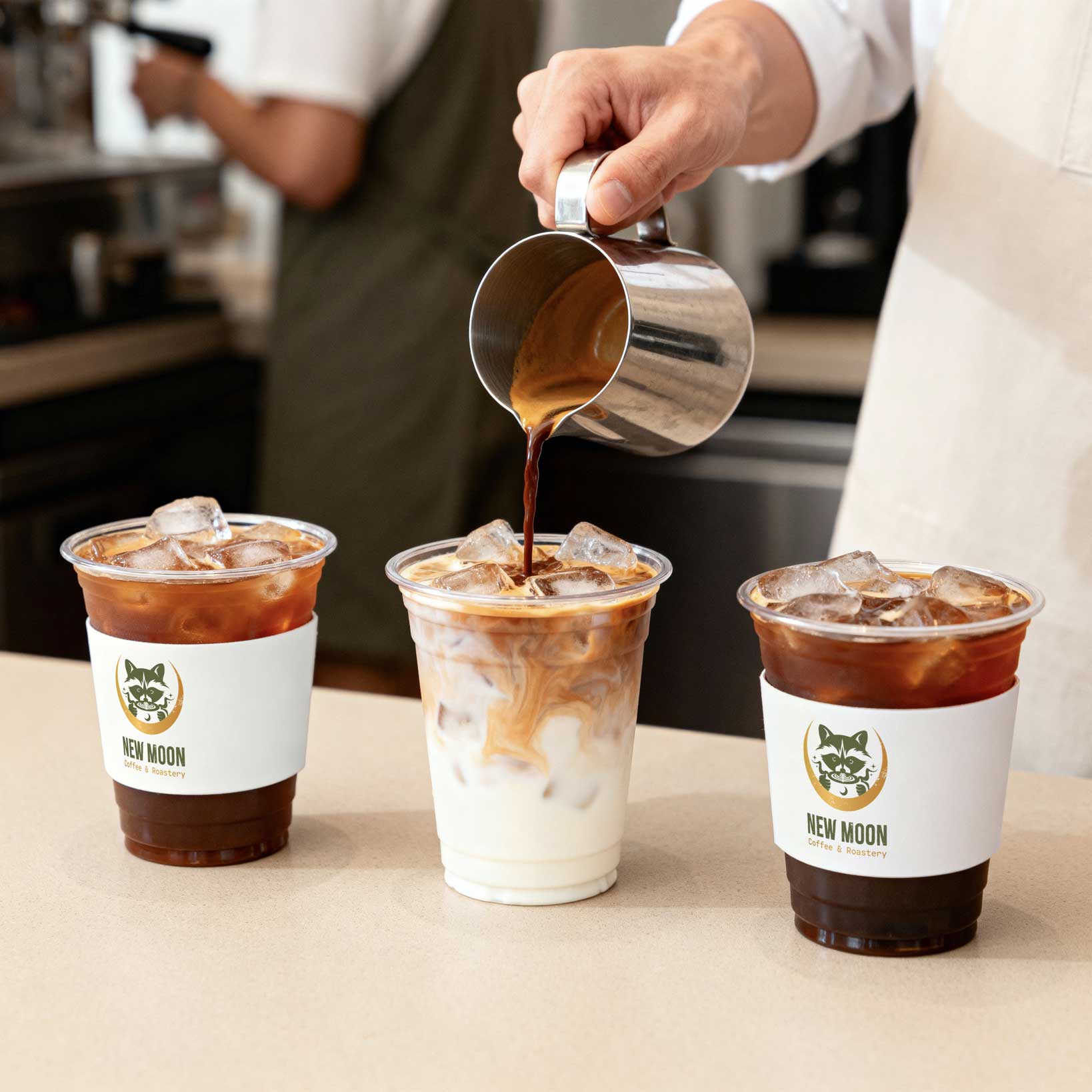
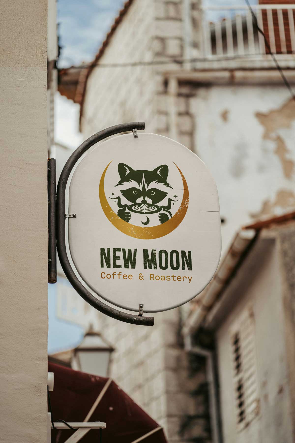
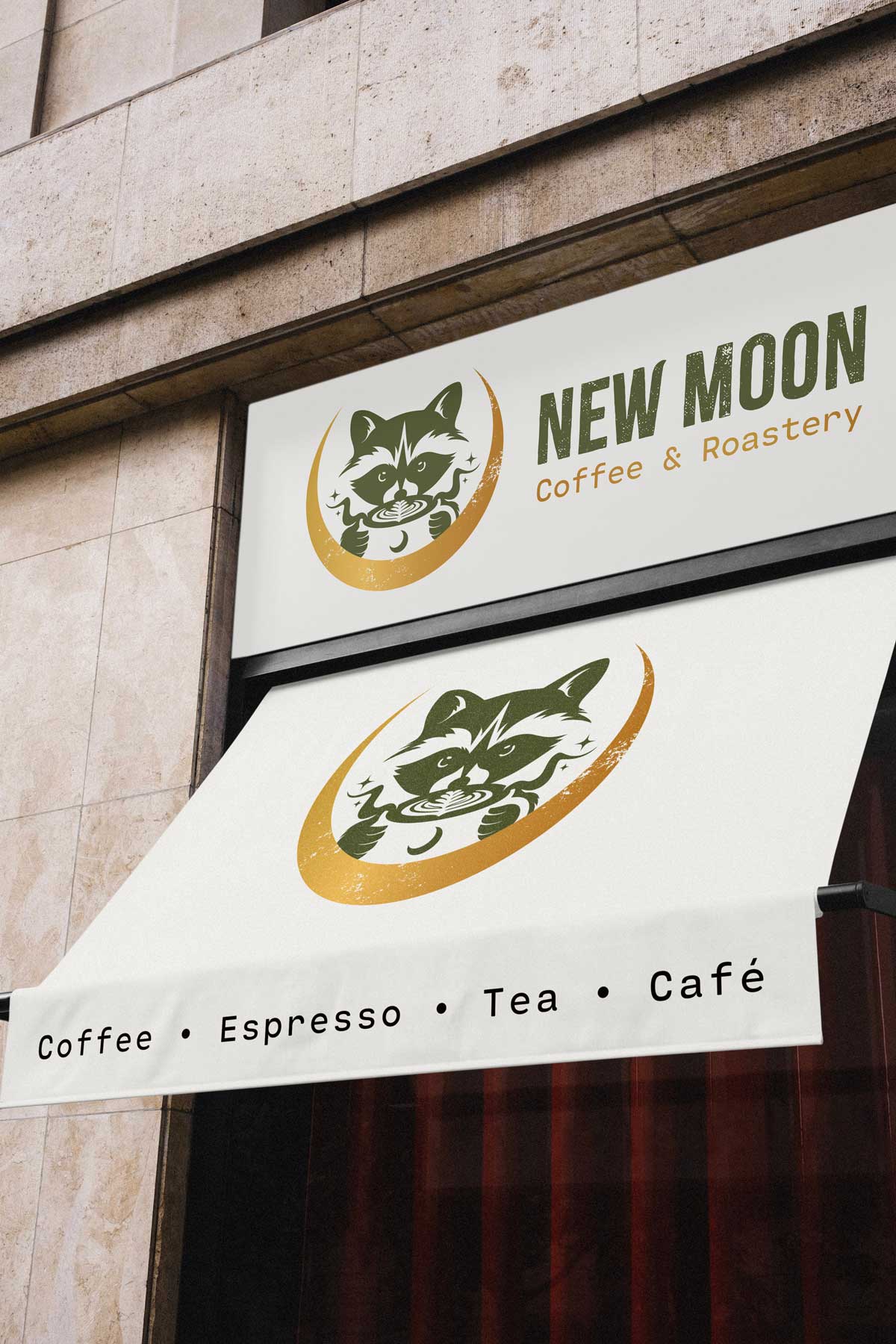
The guide outlines logo usage across a multitude of formats, including primary and secondary lockups, heavily simplified icon variants and scalable favicon treatments with detailed guidance on structure, padding and minimum size requirements. I also defined how the brand should be applied in physical contexts, such as storefront signage, window clings, staff uniforms (barista aprons and t-shirts) and packaging, ensuring that the logo maintains visibility, contrast and character no matter the size of the logo or the physicality of the medium.
The guide also features a curated and lovingly named earthy color palette inspired by the founder's original Pinterest board and echoing the warm inviting aura of a local café. The color palette showcases warm greens, deep browns and neutral tones paired with a typographic system that balances rustic charm with contemporary clarity. Together, these elements give New Moon a cohesive, memorable presence. It's also just really fun to be able to name colors and have it mimic the brand, with color names like Matcha, Coffee Bean, Crema and Oat Milk. It also makes it easier for brand stakeholders and partners to communicate brand colors without referring them plainly as hex codes or Pantone numbers.
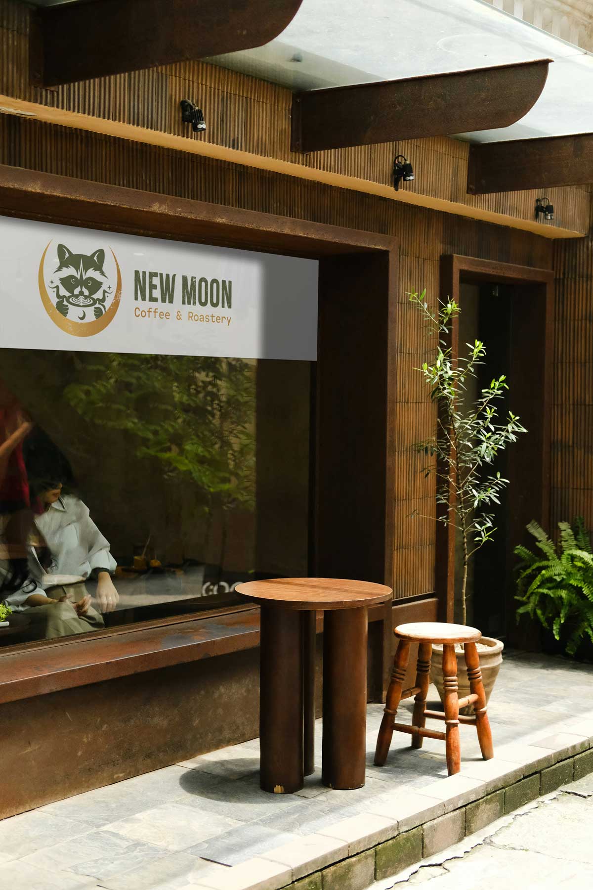
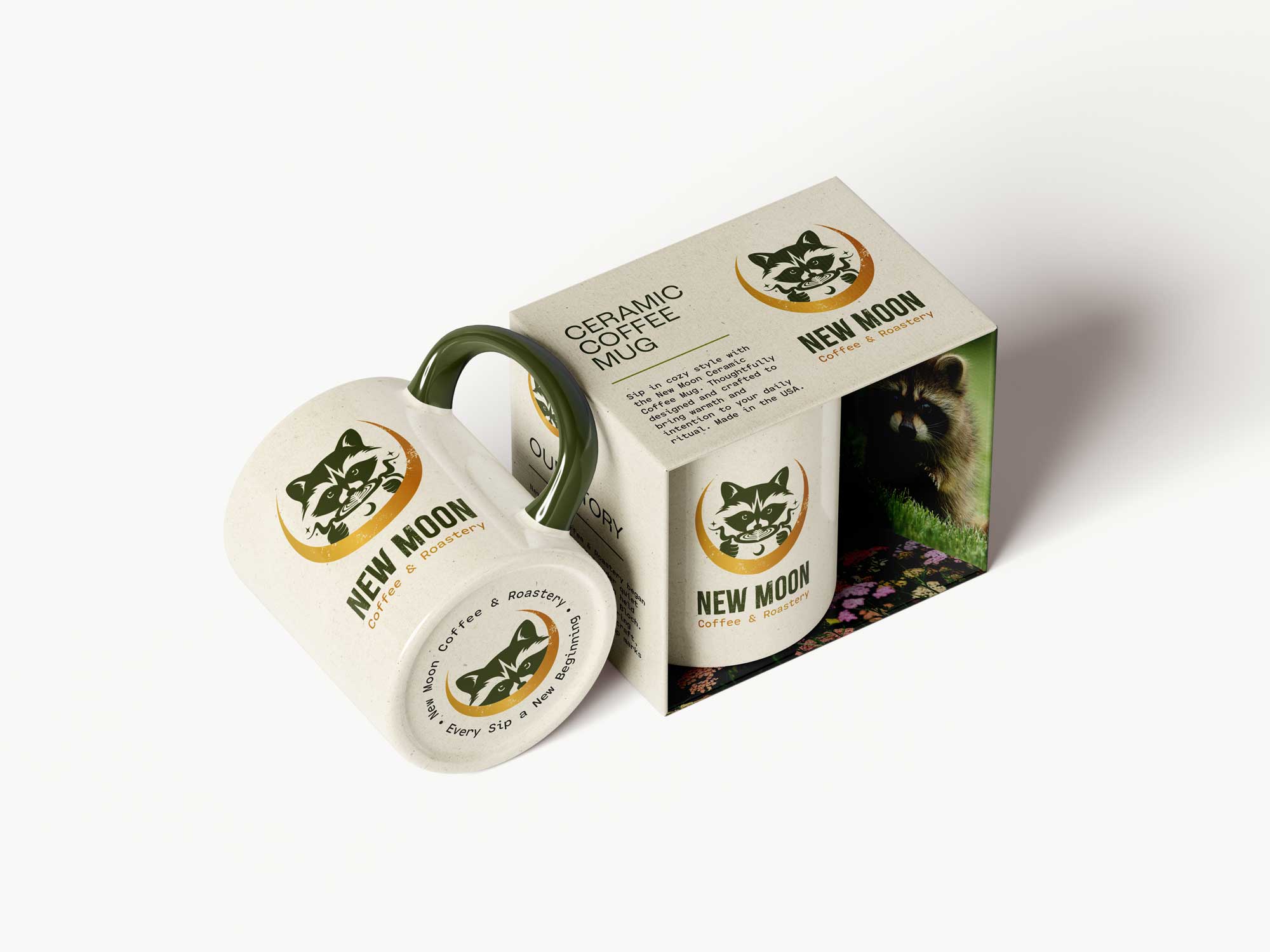
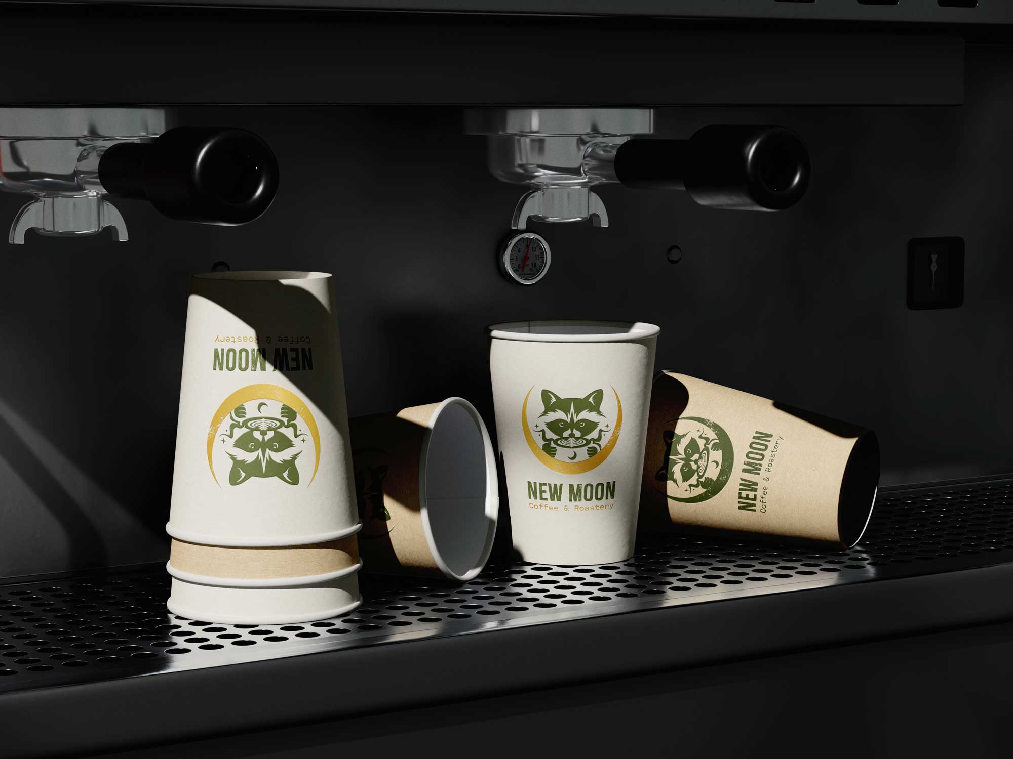
Making a Vision Come to Life
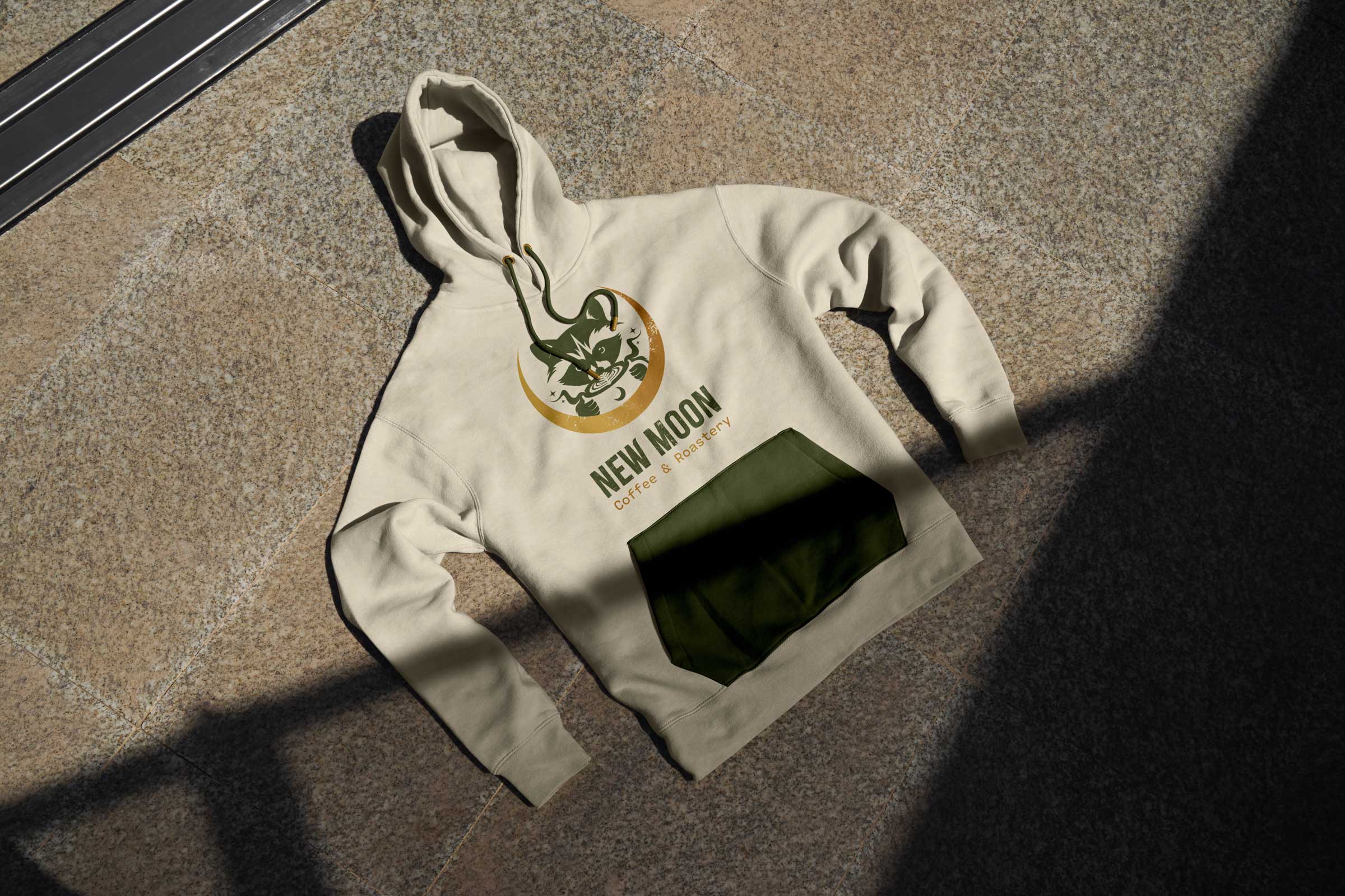
To help the client visualize the brand in the real world, I went beyond the standard deliverables by creating a series of immersive mockups, from various different storefront signage approaches to custom packaging and product concepts.
This included a ceramic mug design tailored to the shop’s cozy aesthetic and an extended merch line. These visuals not only help bring the vision to life in context, but also helped guide the client to imagine how New Moon Coffee could expand and evolve.
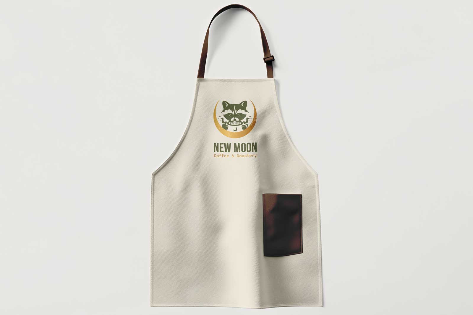
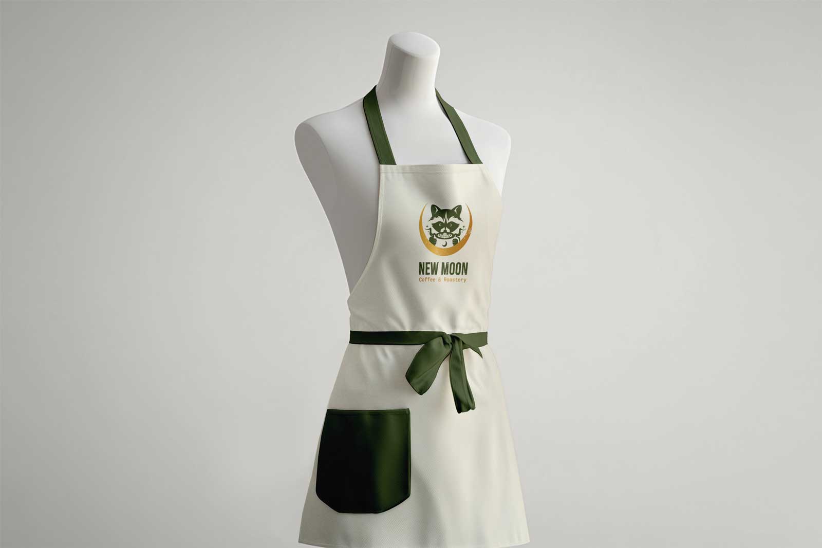
Barista Aprons
As part of the brand rollout, I designed a set of custom barista aprons. The goal was to ensure the aprons felt both functional and representative of the brand, elevating the in-store experience for staff and customers while reinforcing the identity's visual language. I developed two distinct offerings, a classic cut featuring a leather halter, which offers timeless utility and a touch of masculine appeal in contrast to the elegant cut, designed with a more tailored hourglass silhouette in mind.
In Closing
Designing the New Moon Coffee brand was a truly rewarding experience, the kind of project that reminds you why you love what you do. It’s not every day you’re asked to blend a raccoon, a crescent moon and a cup of coffee into a single logo, and even rarer to collaborate with a client as gracious, visionary and creatively open.
I'm proud to have helped bring this concept to life and excited to see how the brand continues to grow and connect with its community.
Follow @newmoon_coffeeandroastery for the latest updates.

01
About
An area describing what this site is all about, who I am and how I came to be.

02
Portfolio
The most important aspect of the site, a select catalog of works spanning over a decade.

03
Blog
An amalgam of my creative explorations, activities, musings and discoveries.
04
Music
Music is one of the most vital ingredients to my creativity and inspiration. Visit this page to listen to some tunes.

05
Contact
I am always looking to connect with other talented individuals. Reach out for collabs,freelance, or other opportunities.